 For our users who have been using and exploring Operations Dashboard for ArcGIS Beta – thank you for your invaluable feedback and comments on the Esri Early Adopter community forums! There’s been a lot of activity and we greatly appreciate your input. We’ve also seen some nice dashboard apps built with the beta, keep them coming!
It’s been a couple of months since the last beta refresh and we’ve been listening to your input and feedback. We’ve worked hard to continue to improve and enhance Operations Dashboard to meet your needs and we have a new beta update for you to test drive.
Improved Dashboard Management
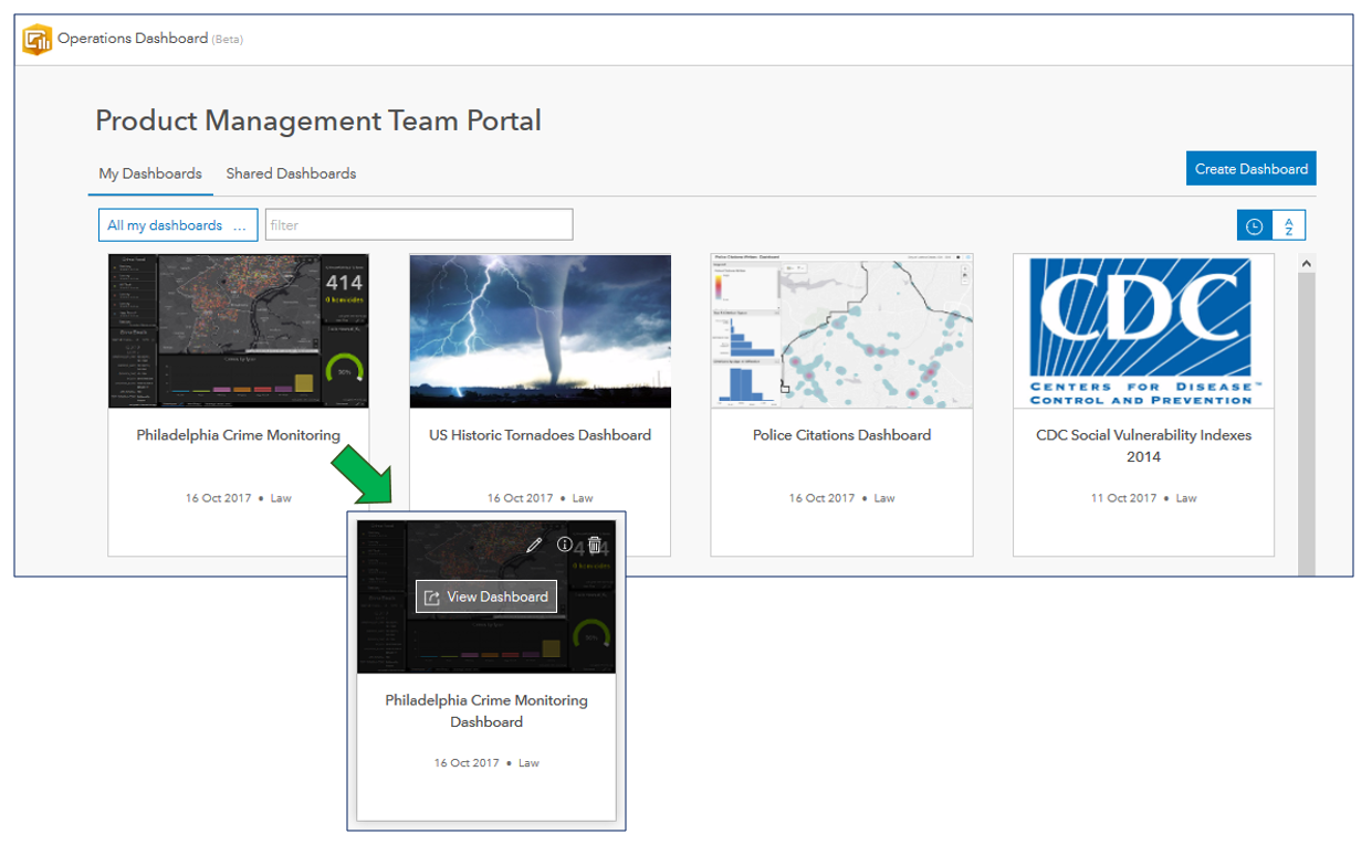
When you start to work with dashboards in your ArcGIS Organization, you typically begin on the dashboard home page. Each dashboard is represented as an item card and new functionality has been added to enable you to view, edit, access the item details, and delete (if you have the appropriate privileges) the dashboard item – when you hover the cursor over a card.
Dashboard Authoring Enhancements
When authoring a dashboard, the navigation bar has been streamlined and redesigned for better usability. When you decide to navigate out of edit mode, we’ll prompt you to confirm any unsaved edits so you don’t accidentally lose any changes. The navigation bar is only visible when authoring a dashboard, it will not appear when viewing a dashboard.
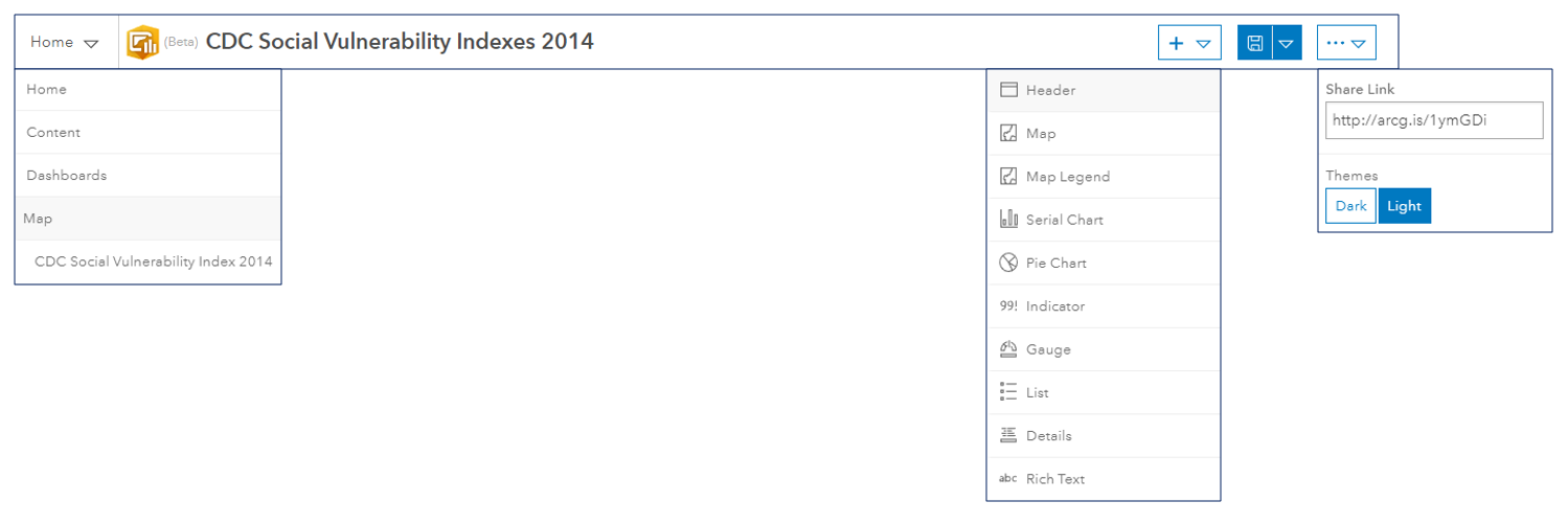
This leads to the next big improvement: header-less dashboards. We recognize that screen real-estate can be a premium and requiring a portion of it to display a header may not always be desirable for all use cases.
While having a header-less dashboard is desirable in some instances, other use cases will benefit from having one. A header can be used for things like clearly stating the dashboard’s purpose, adding corporate identity and branding, providing navigation links to other web pages, etc. To meet this need, we’ve introduced a new element for dashboards: a Header panel – this is a fixed area at the top of the dashboard and can be configured. With just a few configuration steps, you can quickly add a header to any dashboard.
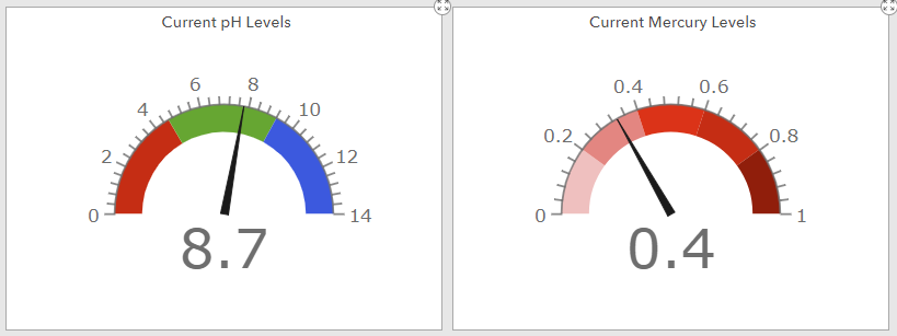
Gauges show the value of a single metric. They are ideally suited for showing progress towards an objective, represent a percentile measure such as a key performance indicator (KPI), or simply showing the ‘health status’ of a parameter. Operations Dashboard includes two different types of gauges: i) progress gauges and ii) meter gauges.
Progress gauges convey that something is moving forward or backward. On a progress gauge, a colored band is used to show a current value and this number can be displayed as a percentage or as the raw value. Intervals can also be defined and these can be used to change the fill band color. This enables the gauge to change its appearance as the measured value progresses (e.g., green = good, yellow = ok, red = bad). Progress Gauges can be rendered in one of three shapes: circle, horseshoe, and half donut.
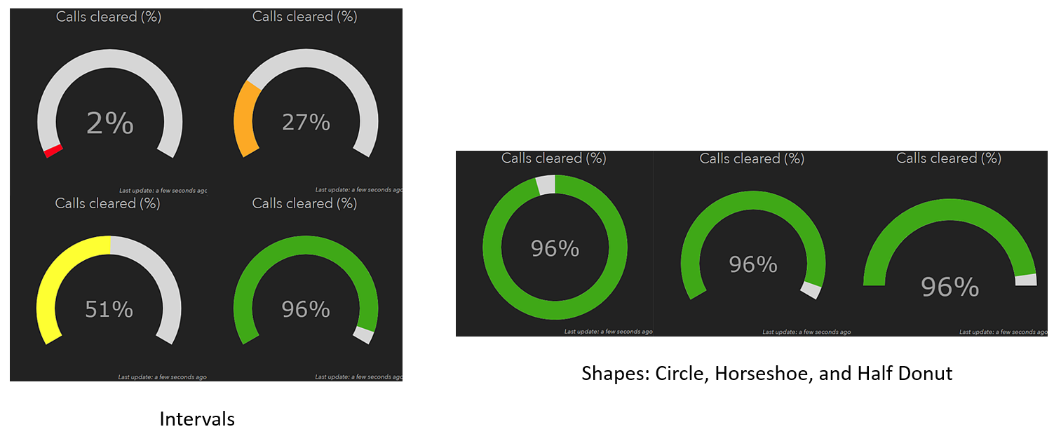
Meter gauges display the amount, level, or contents of a parameter. They also allow for interval ranges to be defined as qualitative ranges (e.g., good, average, and poor). There are many practical real-world examples of meter gauges such as: speedometers, thermometers, voltmeters, ammeters, and pressure gauges. Meter gauges can be displayed in one of two shapes: horseshoe and half donut.
Numbers and Dates
Another aspect of Operations Dashboard that we’ve improved is to provide you with more precise control on how data is displayed in a dashboard.
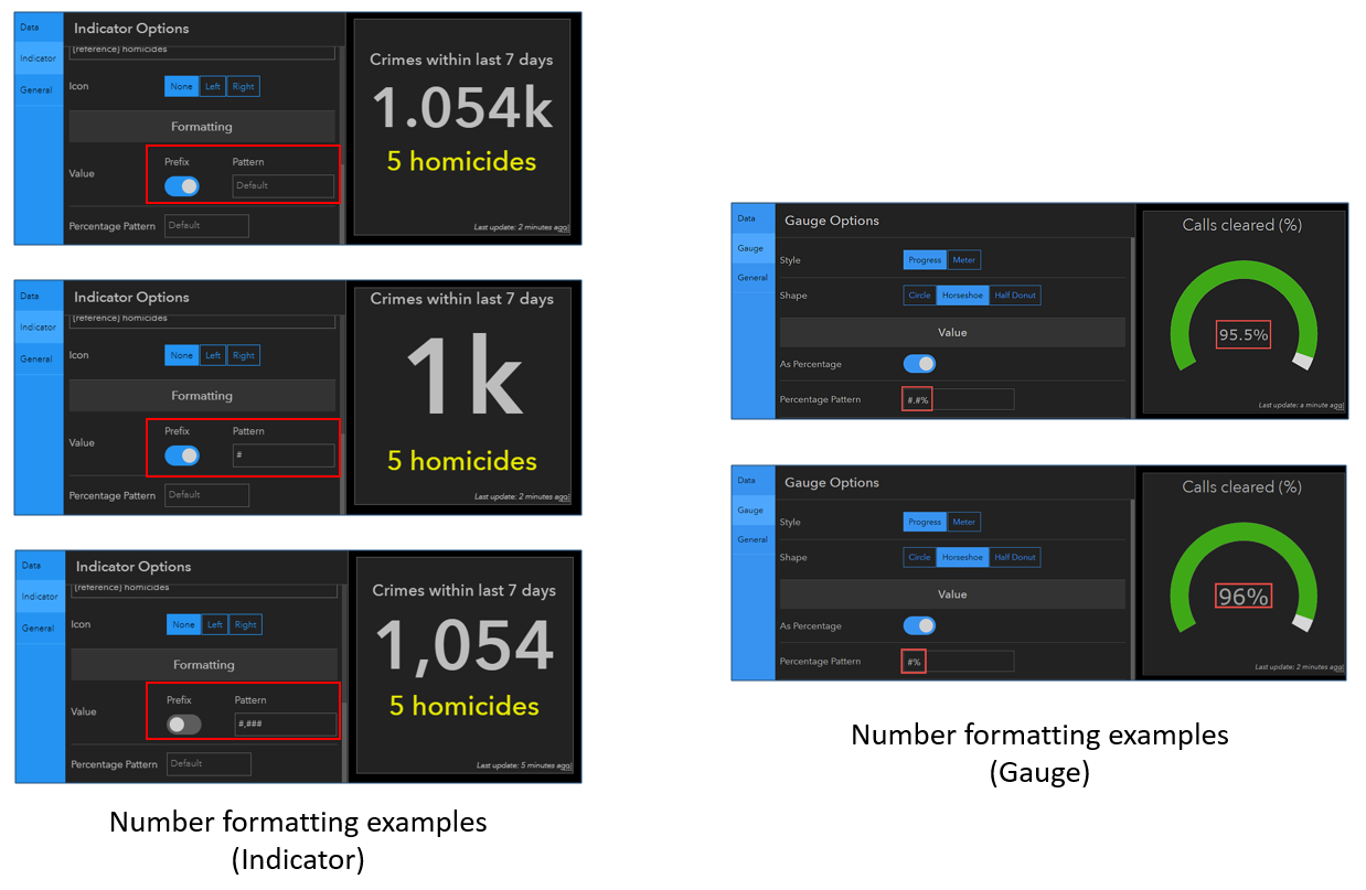
Unit prefixing is a technique for making a number (large or small) easier to interpret. This can be used to de-clutter and simplify the information being presented on a dashboard. This was subtly introduced with Serial Chart in the last beta refresh, but we’ve expanded its exposure in this beta update.

In addition, a lot of work was done on number formatting. When numeric data is shown in Operations Dashboard, the app will attempt to format and parse the data and render it to conform to the ArcGIS organizational account local settings (i.e., the locale set in the account user profile). For example, a user in Canada or in the United States would expect the number one million with two decimal places to be represented as “1,000,000.00”, whereas a user in Germany would expect “1.000.000,00”, and a user in France would expect “1 000 000,00”. For instances where the built-in defaults do not meet specific needs, dashboard authors can override the default behavior by defining a pattern for formatting numbers when they are displayed in visualizations such as the: Gauge, Indicator, and Serial Chart. Combined with unit prefixing, the display of numbers in dashboards has never been more powerful.
Displaying dates (both date and time) is often important on a dashboard. The elements of a date are: year, month, day, hour, minute and second. Configuring a Serial Chart has been improved to give dashboard authors more control for formatting dates along the category axis. Similar to the work done for displaying numbers, date formatting on a serial chart can be used by dashboard authors to show as much (or as little) information about the date as needed.
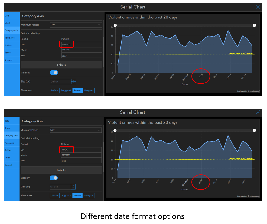
When implementing date formatting, we recognized that not all dates are stored in fields of type date. In some datasets, dates are stored in string fields. Some datasets might also have numerical data that is stored in string fields. To meet this requirement, we’ve added date and number parsing functionality when configuring a Serial Chart. When a string field is used to define serial chart categories, dashboard authors can indicate that the strings actually represent dates or numbers, and the chart will automatically parse strings into dates or numbers. Examples of the pattern syntax for string parsing are as follows:
- yyyy
- yyyyMM
- yyyy/MM
- yyyy-MM
- yyyyMMdd
- yyyy/MM/dd
- yyyy-MM-dd
- yyyyMMddHHmmss
- yyyy/MM/dd HH:mm:ss
- yyyy-MM-dd HH:mm:ss
Expect another beta update early next month where dashboard authors will be able to configure highly-interactive dashboards without any programming whatsoever. For now, we hope you enjoy these new enhancements and we’re excited to hear your feedback on the Esri Early Adopter community forums.
Sincerely,
The Operations Dashboard for ArcGIS Dev team


Article Discussion: